 Xamarin.Forms is an attractive option when building cross platform apps, but for an old XAML developer like myself it can be a challenge to get the nuances of the grammar and syntax right. For Windows I’ve depended on tools like Blend and Visual Studio Intellisense to help me understand what’s possible. Moving to Xamarin XAML is sometimes tedious because while I can use the intellisense from the C# code behind file it’s not there yet in a designer. While there’s some posts out there that compare and contrast how to move to Xamarin XAML from Microsoft XAML (like this one from TCPWare by Nicolò Carandini), I still wasn’t finding what I was looking for. This post is an attempt to iterate thru some of the core proprties of interest for many of the controls I use, and to catalog them here for current and future reference.
1/3/2015 : Update, added more controls to list -
First some common properties – Some common properties to most controls include:
- x:Name : The control name that can be used to reference the control from code
- AnchorX, AnchorY : Positions control within the layout
- HeightRequest, WidthRequest : The requested size of the control if the layout allows
- MinimumHeightRequest, MinimumWidthRequest : The minimum size allowed
- HorizontalOptions, VerticalOptions : Layout options for the control, include values Start, End, Fill, Center, StartAndExpand, EndAndExpand, CenterAndExpand
- BackgroundColor : Color of background
- Rotation, RotationX, RotationY : Rotation properties for rendering control
- Scale : Scale value
Label - Displays text on a page.
- XAlign, YAlign : Text alignment property…values include TextAlignment.Start, TextAlignment.Center, TextAlignment.End
- TextColor : Color of text and background…can be named color
- Font : Attributes of the font, such as Bold, Italic, Large, Medium, Small, Micro,
- LineBreakMode : Used to determine label’s text wrap properties. Values include CharacterWrap, NoWrap, WordWrap, HeadTruncation, MiddleTruncation, TailTruncation
TextCell - Displays text and detail subtext in a single control
- Text : The main text to display
- TextColor : Primary color of the text
- Detail : Subtext displayed below main text
- DetailColor : Color of secondary text


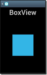
 BoxView - Similar to Rectangle in Windows XAML. Used to display a box with some color on a page.
- Color : Color of box
- Opacity : Value of opacity…
- IsEnabled, IsFocused : properties of Box
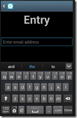
Entry - Similar to TextBox in Windows XAML. Used to get input from user.
- TextColor : Color of text and background…can be named color
- IsEnabled, IsFocused, IsPassword, IsVisible : Values that drive entry behaviors
- InputTransparent : Determines whether to show input
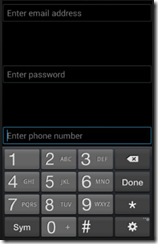
- Keyboard : Type of keyboard to show, possible values include Chat, Default, Email, Numeric, Telephone, Text, Url
- Placeholder : Text to display when there is no value entered…displayed in grayed out mode
- Text : Value of control
Image - Display an image. Includes common properties and:
- Aspect : Scaling of image…stretch or fill. Values include Fill, AspectFill, AspectFit
- IsEnabled, IsFocused, IsLoading, IsOpaque, IsVisible : Drive behaviors of image control
- Source: This is where the image is sourced from…can be local resource or online.
ImageCell Displays an image and a TextCell
- ImageSource
- Text, TextColor
- Detail, DetailColor
- IsEnabled
Button - Used to trigger event processing in response to user’s actions
- BorderColor, BorderRadius, BorderWidth : Values to control the border of the button
- Command, CommandParameter : Values for the command to be executed when clicked
- Font : Attributes of the font
- IsEnabled, IsFocused, IsVisible : Values to drive button’s behaviors
- Text : Text on the button
- TextColor : Color of text on the button
ActivityIndicator. An indicator that shows there is an action processing and the user needs to wait for it to complete
- Color : Color of the indicator
- IsEnabled, IsFocused, IsRunning IsVisible : Values to drive activity indicator’s behaviors
ProgressBar. Used to display how far along a process is
- IsEnabled, IsFocused, IsVisible : Values to drive the control’s behaviors
- Progress : Value to show completion…I think this is a value from 0.0 to 1.0
TimePicker. Used to select a time value
DatePicker. Similar to TimePicker, but used to select a date
- Date : The date value of the control
- Format : Format to display, using standard C# formats
Switch. Used to input whether a boolean property is true or false
- IsToggled, IsEnabled, IsVisible, IsFocused : Drive control’s behaviors
SwitchCell. Displays a label and a switch
- Text : The text of the label
- On : A boolean value of whether the switch is toggled
- Height : The height of the control
ViewCell. A basic layout control that displays an item in a data template. Does not have the basic properties.
- Height : Height of cell to display
StackLayout. Similar to a StackPanel in Windows XAML, used to display items in a stack. Has the common properties as well
- Padding : The area around the layout, displayed as an integer or series of values “left, top, right, bottom”… i.e. “20,0,0,0” means left margin of 20, zero on other sides
- Spacing : The area between items
- Orientation : Horizontal vs Vertical
Grid. Layout in Columns and Rows, using various spacing options, such as fixed, Auto and Star – *
- RowDefinitions, ColumnDefinitions : Same as Windows XAML
- RowSpacing, ColumnSpacing : distance between columns and rows, defaults to 6 px
ListView. Container for collections of items…
- ItemsSource : The data collection used to populate the list
- SelectedItem : If an item is selected in the list
- IsEnabled, IsGroupingEnabled, IsVisible : Drives list’s behaviors
- RowHeight : Height of item’s row
- HasUnevenRows : A flag that indicates row height varies
- Triggers : connects an item to a behavior
- ItemTemplate : Binding template for item’s display
- GroupHeaderTemplate : Binding template for list’s header
Happy Coding!

(originally posted on www.benkotips.com follow me on http://twitter.com/mbenko)
